
Have you ever added someone as a “Contact” on Flickr? It’s a confusing experience. The core of the problem is the word “contact.” When I call someone a “contact” I assume that I’m going to… well, “contact” them at some point.
That’s not at all what a contact is for on flickr, though. It’s really more like becoming a fan or a follower on other services. It’s probably most like adding someone to a circle on google +.
At the time that flickr was created, however, those services didn’t exist. There wasn’t a concept of identifying a relationship as tenuous and ethereal as what amounts to a personal bookmark.
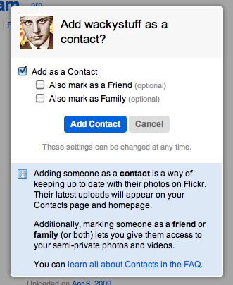
Flickr has persisted with this nomenclature for whatever reason. Over the years they’ve added sub options to approximate what many people at first assume the “contact” role to be. They also have a relatively long explanation of what the action you’re taking means and a link to a more detailed discussion on their FAQ page.
Every time I use this feature I stop short at that dialog. I may have worried that I was doing something other than bookmarking this users photo stream. The fact that there is an important looking note attached to the dialog makes it seem riskier!
Flickr is using the vocabulary they had available at the time. At the time there wasn’t a word for a person that didn’t describe a real world relationship besides the politely non-committal “contact.” A contact can be anyone. If you opened your (paper!) address book back in 2002 you could find just about anyone: friends, family, plumbers and old girlfriends. However, the word “contact” applied to them only in the context of a future or past interaction. On Flickr, the contact doesn’t imply interaction. It’s “liking” or “bookmarking.”
I don’t know what word Flickr would use if it was starting today. I don’t know why they’ve chosen to hang explanations on it instead of just changing the word to something more intuitive. I can imagine why – Yahoo! has a reputation for crushing inertia.
When you’re designing an application for internal use you have a limited audience to explain things to. Often when you encounter an app like that, you’ll find a collection of DailyWTF worthy hacks and kludges. The users work their way around those sharp edges the best they can.
When your application has competition there is no excuse.
- Any time a user has to do something in a way they couldn’t have guessed is a UX failure.
- Any time a user has to redefine a perfectly good english word in their head is a UX failure.
- Any time a user avoids a feature because they’re worried about what will result is a UX failure.
- Finally, any time you have to explain a design decision in prose is a UX failure.
