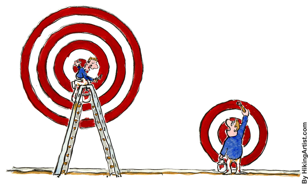
 When is a visitor to your website “converted?” For most websites and analytics programs, the answer is the confirmation page. You may have also heard this page called the Thank You Page or Receipt Page or something else entirely. The fact that it has so many names makes it clear to me that there hasn’t been a lot of attention paid to this point in the conversion funnel.
Whatever you call it the most obvious thing to put on a page like this is a thank you message or receipt that tells your customer that you processed their order successfully. For many online stores, that’s where the discussion ends. Given this page’s position at the end of the conversion funnel, it often does not get much attention.
In this post, we’ll discuss ways to use your confirmation page effectively to do a number of important jobs, such as:
- Increase the size of the just completed order by offering last-minute “upsells”
- Encourage your customers to share your website with their social networks
- Reduce returns, chargebacks and other expensive customer problems
- Encourage return visits
- Get valuable feedback
Selling On The Confirmation Page
 By the time your customer lands on your confirmation page, you’ve already done a TON of work just getting them to this point. The sales process doesn’t end on the confirmation page, though. This is especially obvious if your landing page is serving as a lead generator or just the first step in a longer close.
On e-commerce platforms, however, the confirmation page is almost always an after thought. Have you ever purchased a product online and found your self unceremoniously dumped on a mostly empty page, perhaps with the sentence “Thank you for order.” pasted without formatting in the corner? In fast-moving e-commerce companies, parts of the site that don’t have a specific and measurable impact on The Funnel™ are often given short shrift. These same sites tend to have About Us pages that just say “Put the About us stuff in here.”
It’s understandable that peripheral components of a site will get less attention than the core sales flow. The same thing happens in offices too. The sales staff can ask for a helicopter and just be asked to pick the color, while the “cost center” parts of the company have to turn on the printer with a 7 iron.
The confirmation page isn’t just somewhere to drop off your customers when you’ve had your way with them. It’s your last chance to talk to your customers on their way out the door.
The confirmation page is unique in that you only show it to your most qualified prospects – the ones that have already converted. I find it unlikely that you have nothing more to say to those prospects. They have not only shown a propensity to buy your products, you know exactly what they bought and (hopefully) the trail of referrals that brought them to a conversion. Given that advantage, I hope you can understand how valuable the confirmation page real estate really is.
So what can you sell? It’s impossible for me to list all the possibilities in a general article like this. It depends on your business model and how you develop customers. It might be upgrades, add ons, support, warranties, accessories or similar products.
An important caveat: you are not trying to change your customer’s mind about the sale that was just completed! If you just sold a golf club, the confirmation page is where you sell golf balls and ugly pants, not where you show them what they didn’t buy. Select your upsells with care. It’s tempting to just let a plugin or algorithm do the tedious work of selecting likely upsells (at least if you have a large catalog.) However, unless you have enough sales to be able to make statistically significant guesses, you’re better off using your results to inform a human editor.
On a technical note, most credit card processors will have a system in place for recapturing an additional amount on the same transaction. If this is difficult or impossible with your current vendor, switch. There are so many new options on the market now that are revolutionizing payment processing. With that level of innovation and pressure, it is an ideal time to find a modern and flexible partner.
Social Network Sharing
 A couple of years ago, when working on a medical lead generation app, I suggested that we add a “Tweet This” widget to the confirmation page. “Do you think people will use it?” a colleague asked.
“I’m not sure,” I replied. “I know that I wouldn’t, so that’s a good sign that other people will.” It was hard to imagine why a lead would want to announce to the world that they had just requested information about a medical condition – but they did.
Since that time social media and the urge to “share” has become only more prevalent. Today it’s hard to find a page on the web that isn’t littered with buttons encouraging your to “like” or “share” or “pin” the content. Your customers love to share the most banal events of their day. It is important to capitalize on that.
Adding social sharing features is as easy as copying and pasting a bit of JavaScript from a third-party service, or installing a plugin on your CMS.
When possible, I prefer to make a customized and more compelling widget for the confirmation page. Similar to “Banner Blindness” the common collections of buttons and icons are increasingly easy to ignore.
Some tips on using social media actions:
- Use large and customized CTA buttons
- Show the user the message that they will be sharing in a text area
- Only provide options for the social media sites that your customers actually use. Cut out the obscure ones as they are just a distraction.
- Write your suggested message in a way that makes the customer look good
- At the same time, make the copy express the one core benefit you are providing. Remember, this is an advertisement!
- Follow up with your own action – friend or follow the customer, retweet them and like their comment on Facebook.
- Make the URL they are sharing a readable and public url! There’s no use sending traffic to your confirmation page directly, they need to be directed to your landing page.
- Include campaign and tracking strings on the shared url. This is valuable data that you can use to measure and improve your marketing.
Fix Problems Before They Blow Up
If you’re smart, you keep logs of your customer service interactions. If you’re very smart, you sort that data and use it to understand how your customers are having problems and how you can optimize your product to address those concerns.
 If you can’t improve your product in a way to solve some common issues, your next best bet is to explain the situation as clearly as possible. The confirmation page is a prime location to include tips on how to use your product, solutions to common problems and links to your support forums or helpdesk.
If you have a product that requires training, get your customers started immediately. One effective practice is to make your confirmation page the first page of a “product tour” that will engage your customers and validate their purchase decision. My favorite type of product tour is one that doesn’t just show the customer what to do, but guides them as they actually start using the product.
Build A Relationship
Your relationship with this particular prospect has just undergone a massive change. They’ve gone from an interested prospect to a converted customer! Outside of funeral homes and vasectomy clinics, it’s rare that a business is only interested in selling to a customer once.
Relationship building features like subscribing to your newsletter, following you on twitter or just bookmarking your site are valuable tools to turn a new convert into a lifelong customer.
First impressions are important, but deep and satisfying relationships take time and attention. Use your confirmation page as an opportunity to start your relationship with your customer on friendly terms.
Listen To Your Customers
 Look at a receipt. Check your pockets or purse, I’m sure there’s one nearby. Chances are there is a phone number or web address on the bottom of that receipt. Often you are promised a free order of fries or entry into a sweepstakes for participating.
Smart businesses listen to their customers. Your confirmation page is a great opportunity to open up for feedback. Whether it’s just a freeform text area asking for a comment or a multi-step survey, you can gain valuable and actionable information if you just ask.
If you have a landing page, you have a confirmation page. It might not be a page at all – it could be no more than a notification after an ajax call. In whatever form it takes, it is a prime opportunity to engage your customers and grow your business. Use your confirmation page to sell, share, teach or listen – the important thing is to not waste it!


